EBAGS DESIGN CHALLENGE
CREATE AN EMAIL CAMPAIGN THAT WILL SHOWCASE CLIENTS TRAVEL ACCESSORIES
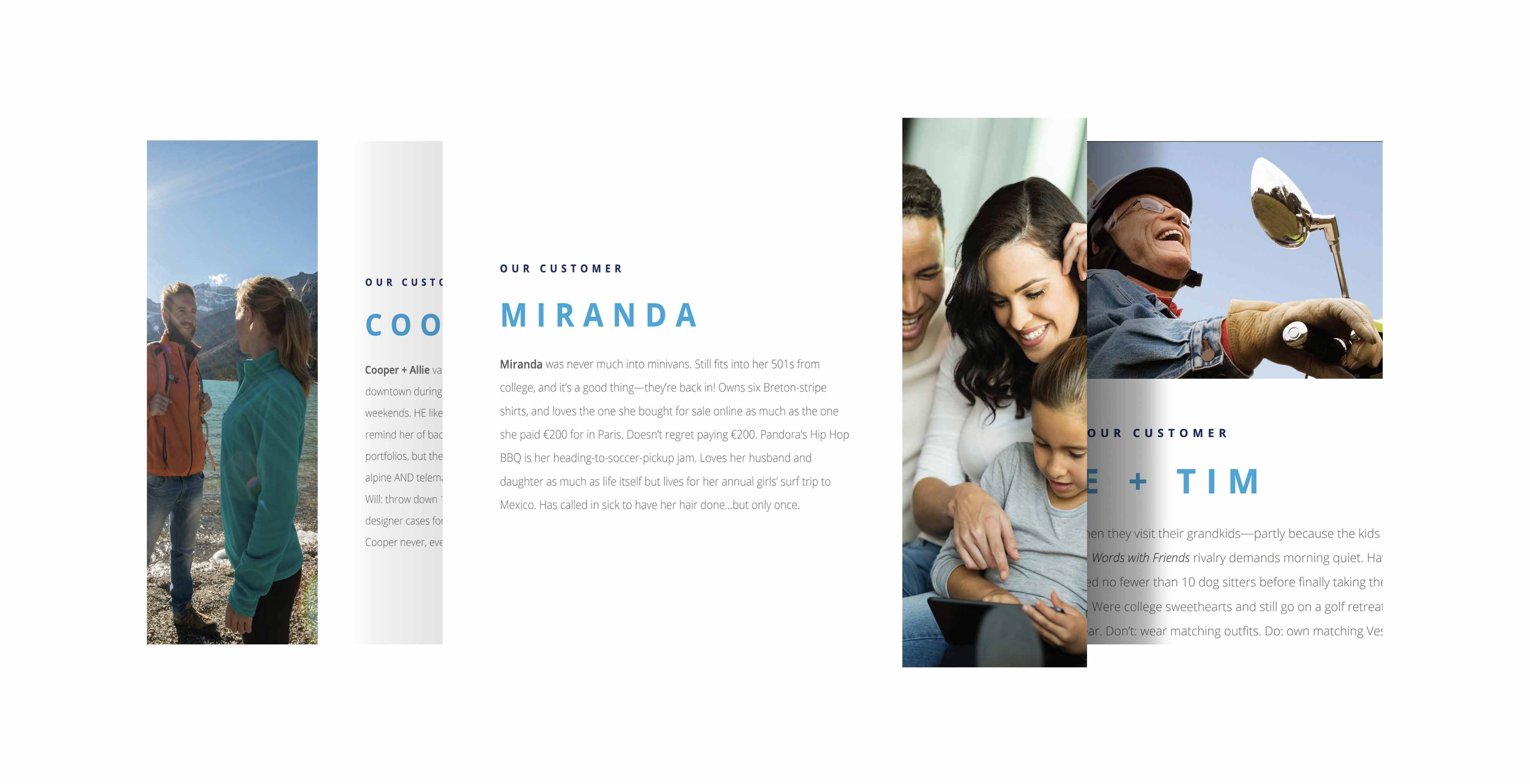
PERSONAS
Based on client's personas, I was able to focus on three types of customers journey that I wanted to target within the email campaign.
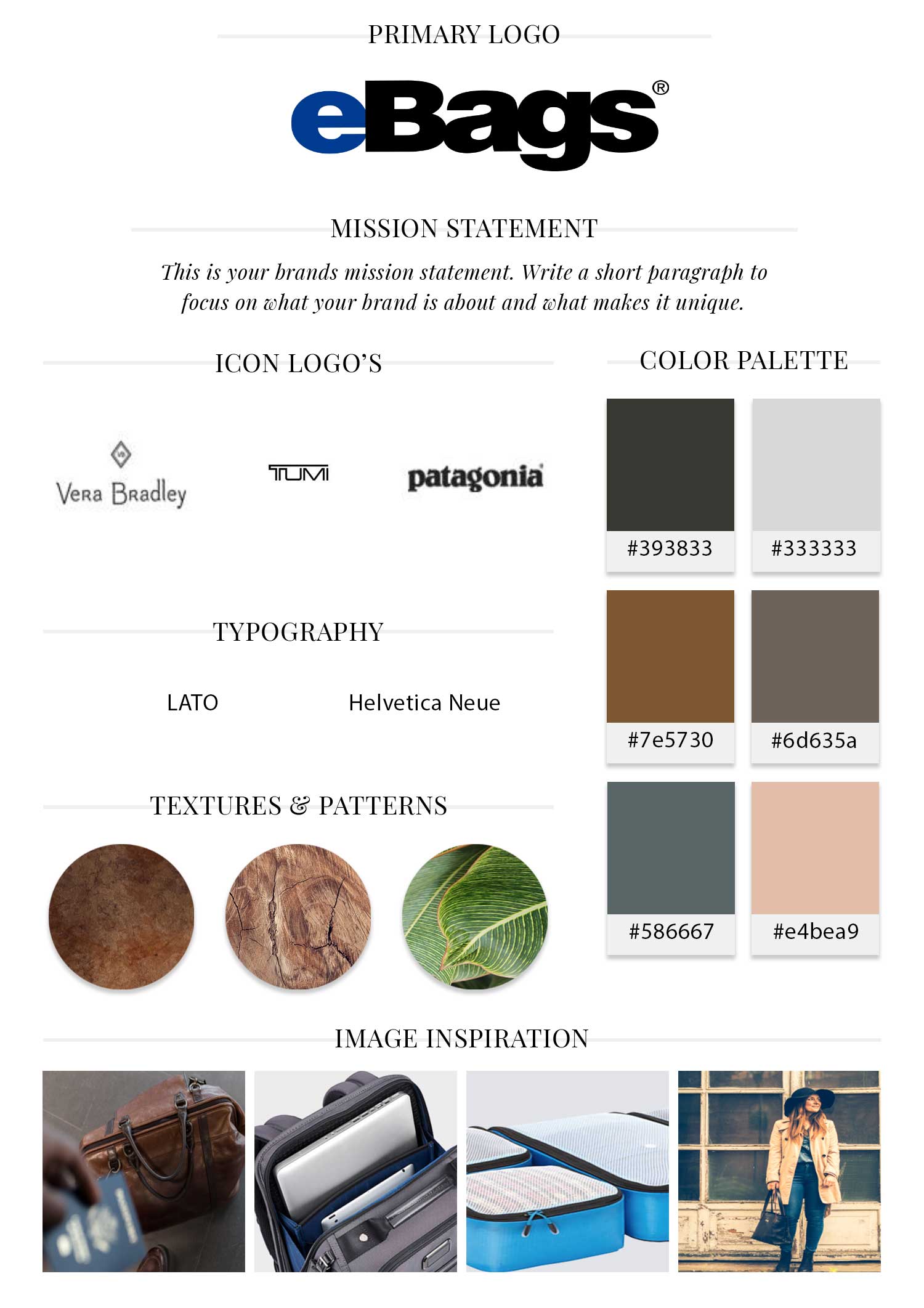
BRAND/STYLE
Creating a brand/mood board, I was able to gather some ideas as far as color, fonts and images that supports client's current branding and style.
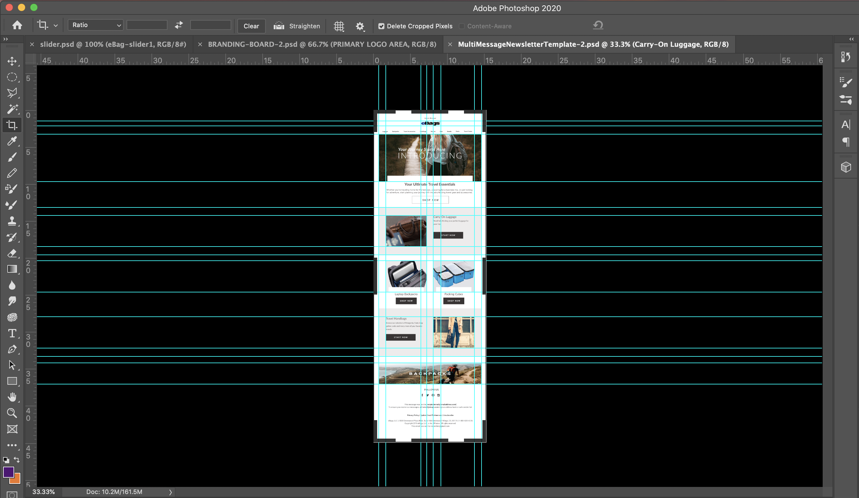
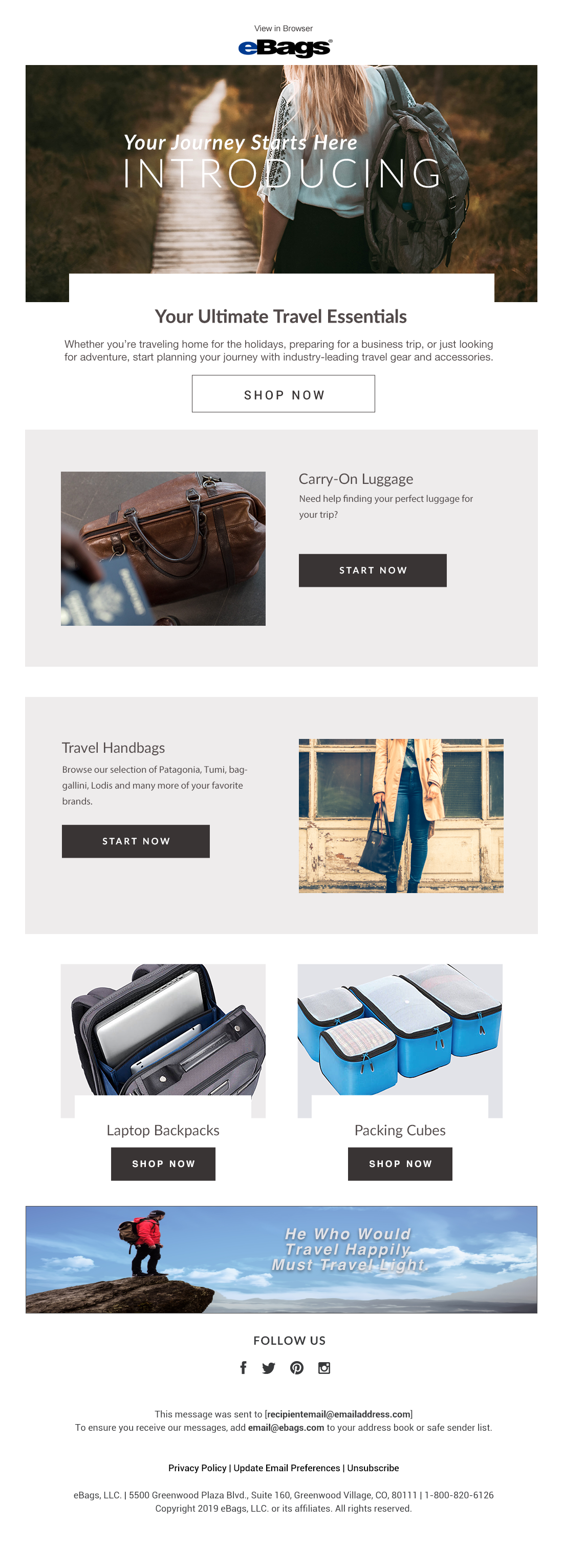
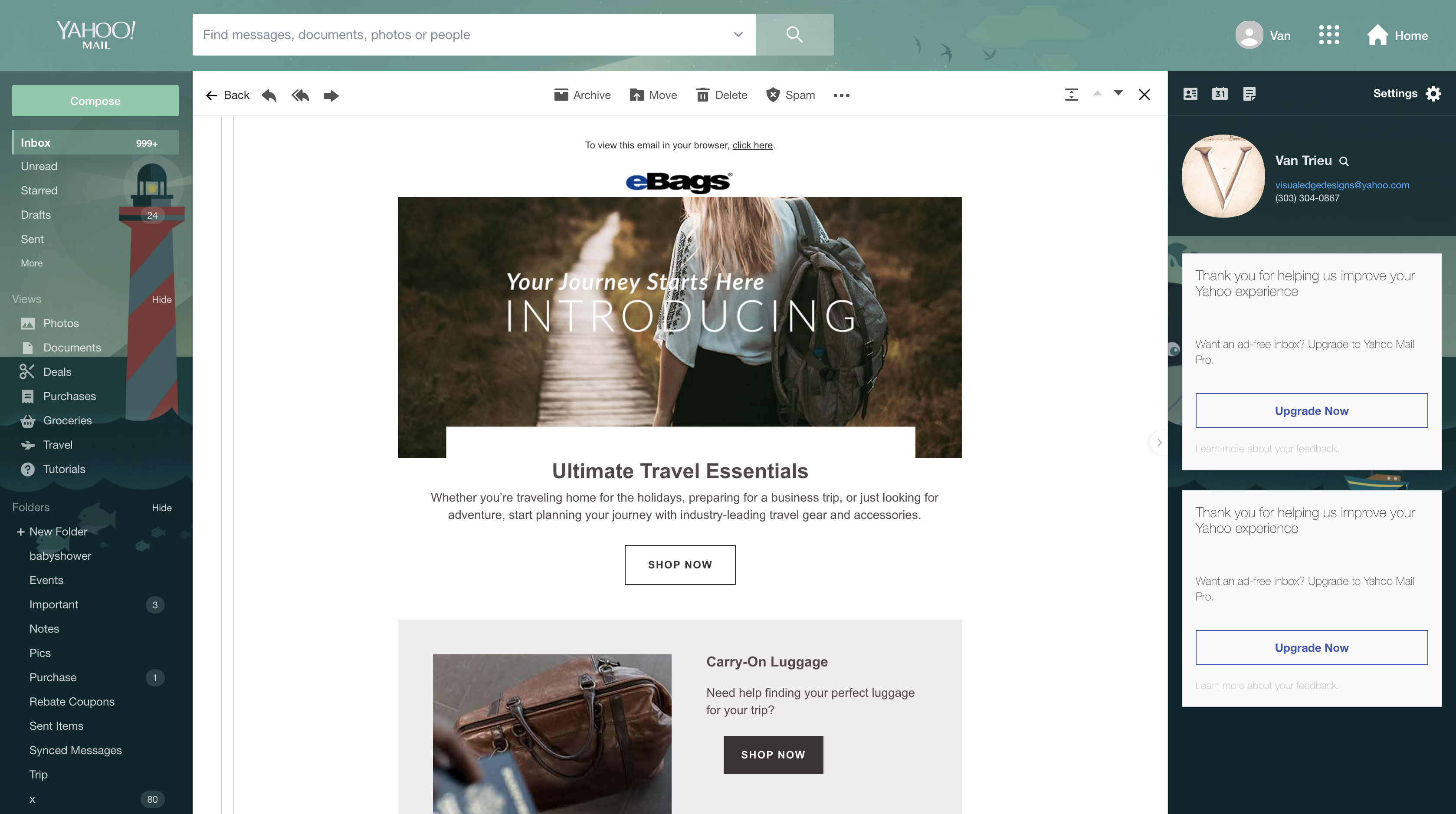
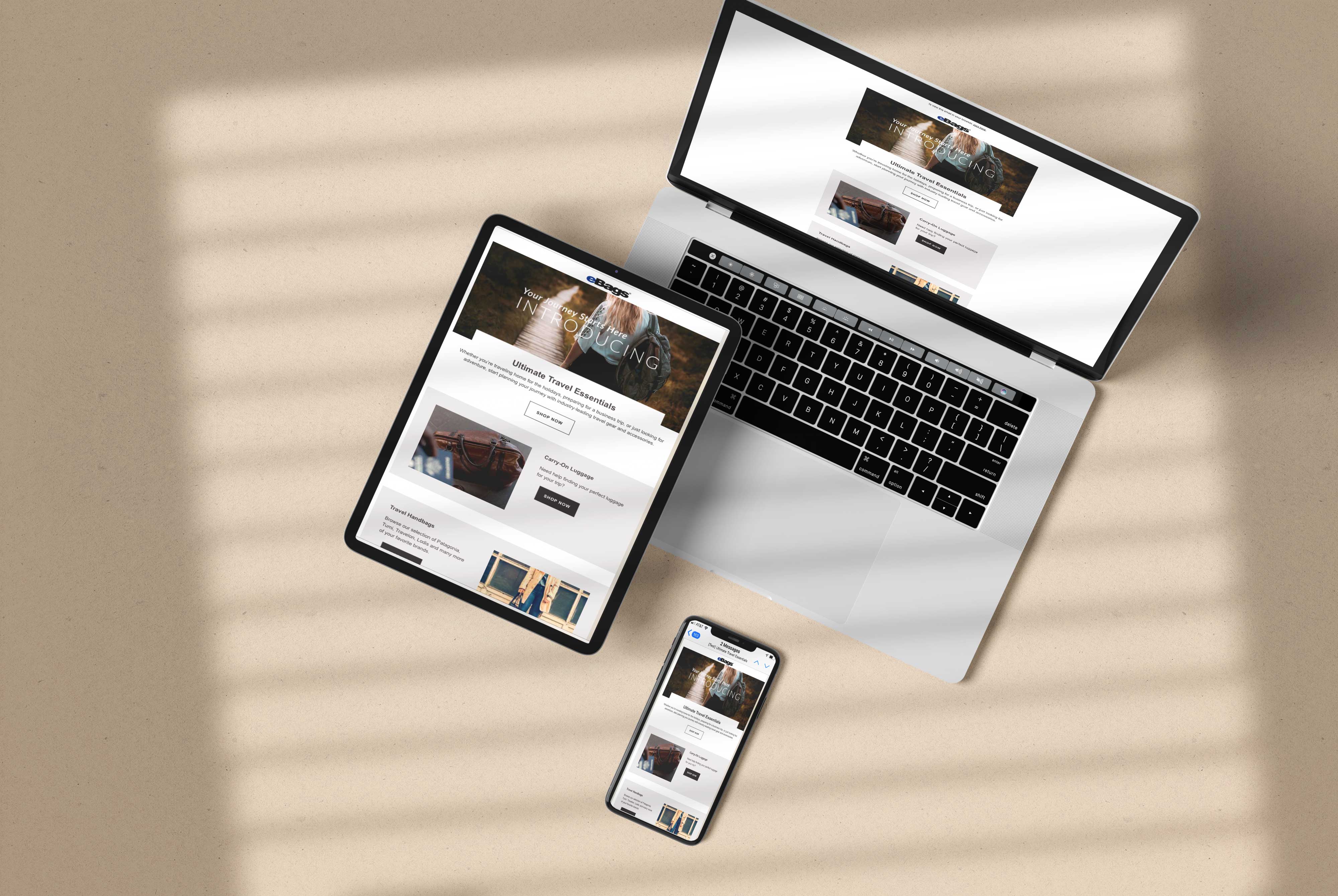
WIREFRAMES
Creating a high fidelity mockup using Photoshop, I was able to put together a design layout that supports a responsive email design template for desktop and mobile.